 |
| Opposition - Blakemere Moss Ink on Rice Paper 28cm x 20cm (11" x 8") |
Chapter 3 of Composition by Arthur Wesley Dow is about creating harmony in line drawings. His central premise is that harmony requires good spacing. He identifies five ways of arranging and spacing lines that he calls “Principles of Composition”. The first of these is Opposition, which he defines as:
Opposition - Two lines meeting form a simple and severe harmony.
The initial exercise for the topic is to copy examples from the text. This provided me with some useful extra practice in line drawing with a Japanese brush (see Line Drawing).
 |
| Examples of Opposition - copied from Composition Ink on Paper 25cm x 29cm (10" x 11.5") |
Dow recommends holding the brush perpendicular to the paper. At first, I was in danger of giving myself an RSI because my hand position was so cramped and unnatural, but I’ve gradually found a more relaxed way to hold the brush.
This has made the exercises more enjoyable and has reduced the unsteadiness in my lines, but they are still quite shaky. The brush exaggerates every movement, but Dow suggests not worrying because “Slight waverings are not objectionable; in fact they often give character to the line.”
The second exercise is to design mouldings, plaids and rectangular panels based on arrangements of straight lines.
Dow recommends the proportions of the Parthenon, so I started by designing a plaid based on a view of the Parthenon.
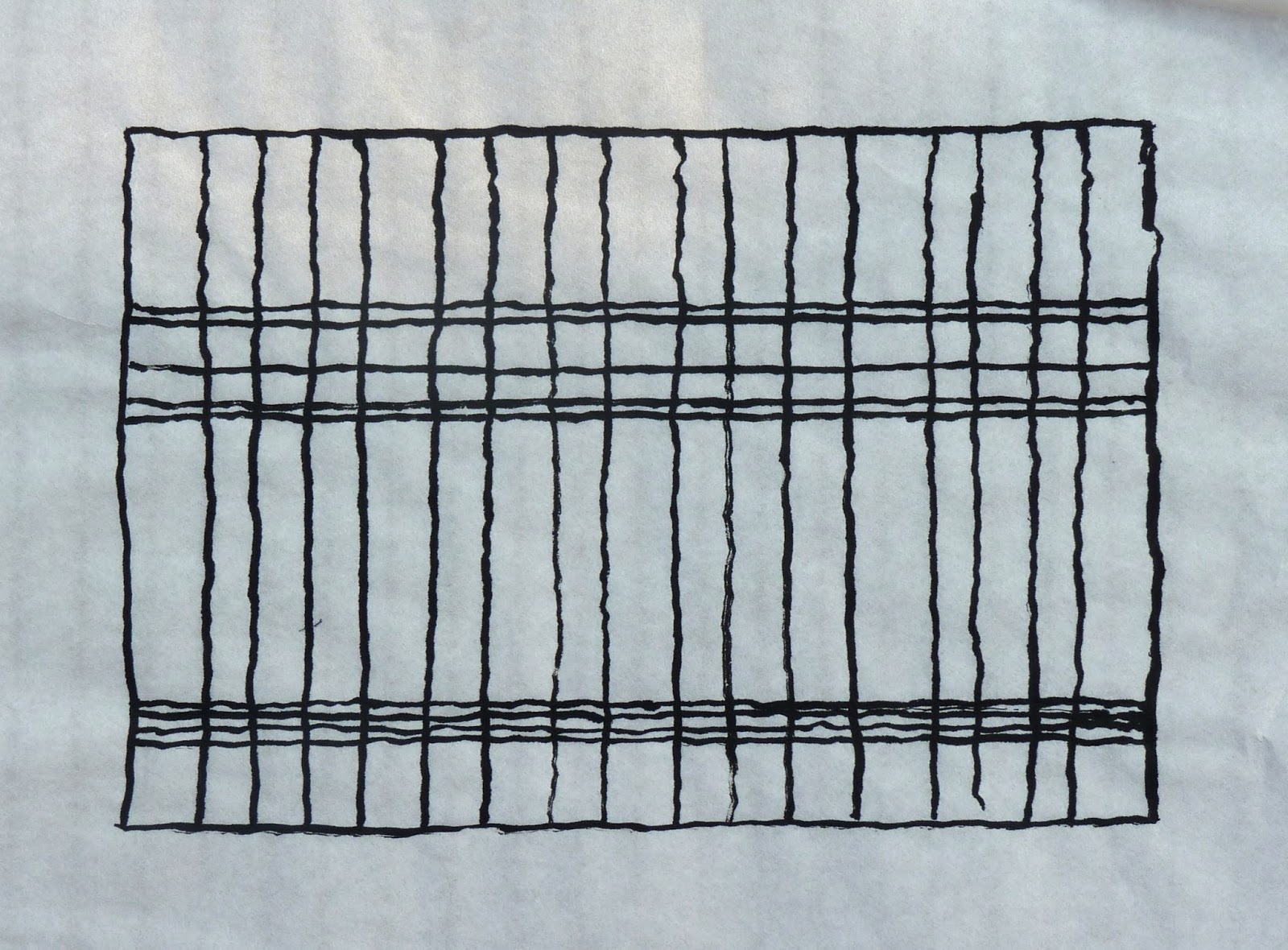 |
| Parthenon Plaid Ink on Rice Paper 26cm x 18.5cm (10.25" x 7.25") |
I followed this by trying to spoil the underlying grid from Mondrian’s “Composition with Yellow, Blue and Red”
 |
Mondrian Plaid Ink on Rice Paper 18cm x 18cm (7" x 7") |
I discovered that if you add too many lines you can spoilt it, but you can add a couple of lines just about anywhere with relative impunity.
 |
Spoiling Mondrian Plaid Ink on Rice Paper 18cm x 18cm (7" x 7") |
I concluded the exercise with some plaids based on famous design maxims: rules of thirds, golden ratio, rabatment, L shaped composition and H shaped composition.
 |
| Design Maxim Plaids Ink on Paper 11.5cm x 23cm (4.5" x 9") |
Do plaids based on these divisions look any better than plaids based on arrangements that are more random? I don’t think they do. To my eye:
- A single division along the centre line is the only arrangement that particularly jars
- The intersections of horizontal and vertical lines are pleasing - precise placements don’t seem to be that important
- Equally spaced lines are agreeable, but some disorder is more interesting
- Repetition with variation is particularly appealing
The last exercise is to find and draw examples of Opposition from nature. The drawing at the top of the post is based on the photographs I used as reference for Blakemere Moss.
You can find another description of Opposition in the post Principles of Composition: Opposition and Transition on Paul Foxton’s Learning To See blog.
No comments:
Post a Comment